
Grønt Punkt-symbolet
Grønt Punkt-symbolet er en kvittering som beviser at bedriften har tatt sitt lovpålagte produsentansvar, ved å betale for innsamling og gjenvinning av emballasje gjennom medlemskap i Grønt Punkt Norge. Å vise at bedriften har tatt miljøansvar er positivt for bedriftens omdømme.
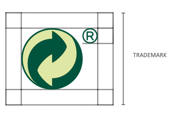
Grønt Punkt-symbolet skal brukes uten tekst, men med Registered trademark ®. Dette praktiseres likt i hele Europa.
Grønt Punkt-symbolet og piktogram med tekst
Vi anbefaler at Grønt Punkt-symbolet står til venstre for sorteringsmerket. Grønt Punkt-symbolet skal stå helt alene, og ikke fremstå som felles grafisk element med sorteringsmerket eller dens tekst.
Mellom Grønt Punkt-symbolet og sorteringsmerket bør det være luft tilsvarende bredden på ®.
Størrelse
Symbolet bør ikke være mindre enn 10 mm. På veldig liten emballasje kan høyden reduseres unntaksvis til minimum 6 mm.
Anbefalt minste størrelse:

Fargebruk
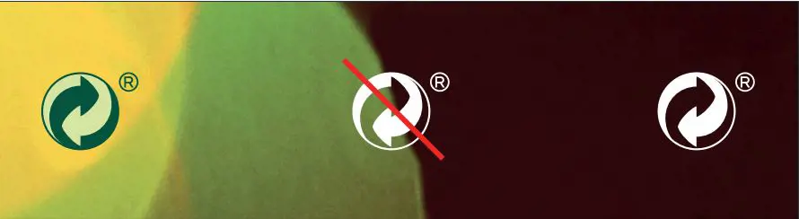
Grønt Punkt-symbolet trykkes i riktige grønnfarger, i én farge, eller i negativt sort eller hvitt. Farge er valgfritt så lenge det tas hensyn til kontrast, og at symbolet blir synlig på emballasjen. Den mørkeste pilen skal alltid vende mot høyre.
Anbefalte farger:


Pantone (print) 343 C
CMYK (print) 100 / 00 / 069 / 060
RGB (web) 000 / 088 / 061
Pantone (print) 366 C
CMYK (print) 018 / 000 / 047 / 00
RGB (web) 208 / 228 / 166
Digital bruk og andre flater
Grønt Punkt-symbolet med ® skal kun brukes på emballasje.
Medlemmer i Grønt Punkt Norge oppfordres til å synliggjøre at de tar miljøansvar for emballasje ved å bruke Grønt Punkt Norges logo i blant annet miljørapporter, og på egne hjemmesider sammen med en tekst som forteller at man tar produsentansvar med lenke til www.grontpunkt.no. Last ned Grønt Punkt Norges logo her.
Merk! Last ned logofilen RGB-profil for bruk på skjerm. For å sikre lesbarhet skal Grønt Punkt Norges logo aldri være mindre enn 40x40 px.